From a Regional VP with business-as-usual positioning to a category-defining personal finance brand. Full brand identity, multi-page responsive website, custom preloader with animated figures, and a financial services ecosystem built for growth across 20 states.
Scroll
Client
Elizabeth Weido
Role
Regional Vice President
Market
20 States, Growing
Scope
Brand · Site · Design System
The Brief
Finance that feels personal.
Elizabeth needed to stand out in a crowded financial services space. Her real differentiator: education-first guidance for families, a navy/mint/gold brand voice, and zero tolerance for industry complexity. Weldamm built the entire visual and digital ecosystem from the ground up.
The Opportunity
What walked in the door
18 years of financial services experience
Strong personal network across 20 states
Zero branded presence or digital infrastructure
No cohesive positioning or visual identity
No strategic messaging or personality
No website or digital lead generation
Generic industry messaging and lack of differentiation
What Weldamm Built
A full brand operating system
Navy-mint-gold brand identity system
Education-first positioning and voice guidelines
12-page responsive website with preloader
Custom animated figure system for engagement
Service-specific landing pages for all 4 products
Content architecture for financial clarity
Scalable design system for future growth
Brand Identity
Navy, Mint, Gold. Clear by design.
Elizabeth's brand needed to feel trustworthy (navy), approachable (mint), and premium (gold). The identity system bridges personal finance and professional advisory, speaking to families who want clarity without condescension.
01
Navy
Trust and stability. The foundation. This is the color of security, expertise, and confidence. It says: your financial future is in capable hands.
02
Mint
Clarity and progress. The accent. Fresh, modern, approachable. It signals that finance doesn't have to be overcomplicated. It can be simple.
03
Gold
Wealth and premium guidance. The highlight. Used sparingly for emphasis and moments that matter. Gold elevates the ordinary into something valuable.
"
Finance doesn't have to be overcomplicated. It can be simple. And it should be yours.
Elizabeth Weido
Typography system: Montserrat (headers, clean and contemporary), Playfair Display (italic moments of elegance), Open Sans (body, approachable). The combination signals sophistication without pretense.
Brand Promise
Education first, always. No overcomplicated products. No pressure. Just clear guidance that puts families first.
Primary Palette
Primary
Navy
#0A1A2F
Accent
Mint
#A8E6CF
Highlight
Gold
#C8A84E
Neutral
Bone
#F9FAF8
The Website
15+ Pages Built for Conversion
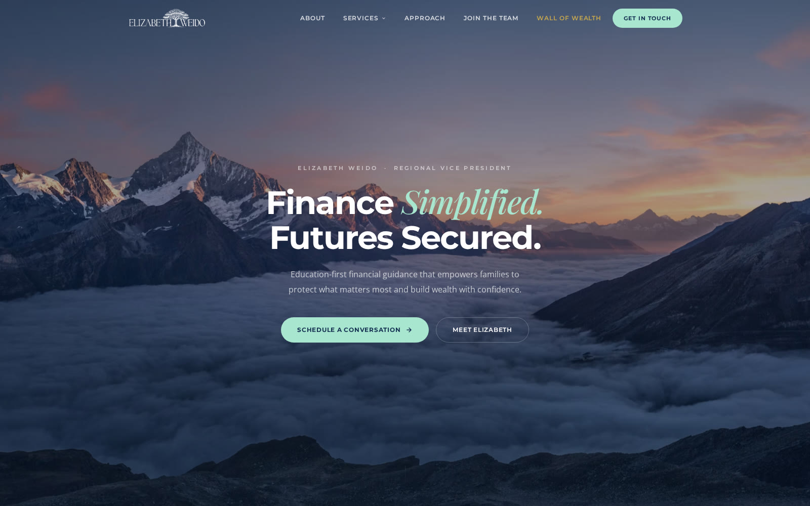
The Elizabeth Weido website is designed to convert visitors into consultations. Every page serves the education-first philosophy. Responsive design ensures clarity on all devices. A custom preloader with animated figures creates immediate brand connection.
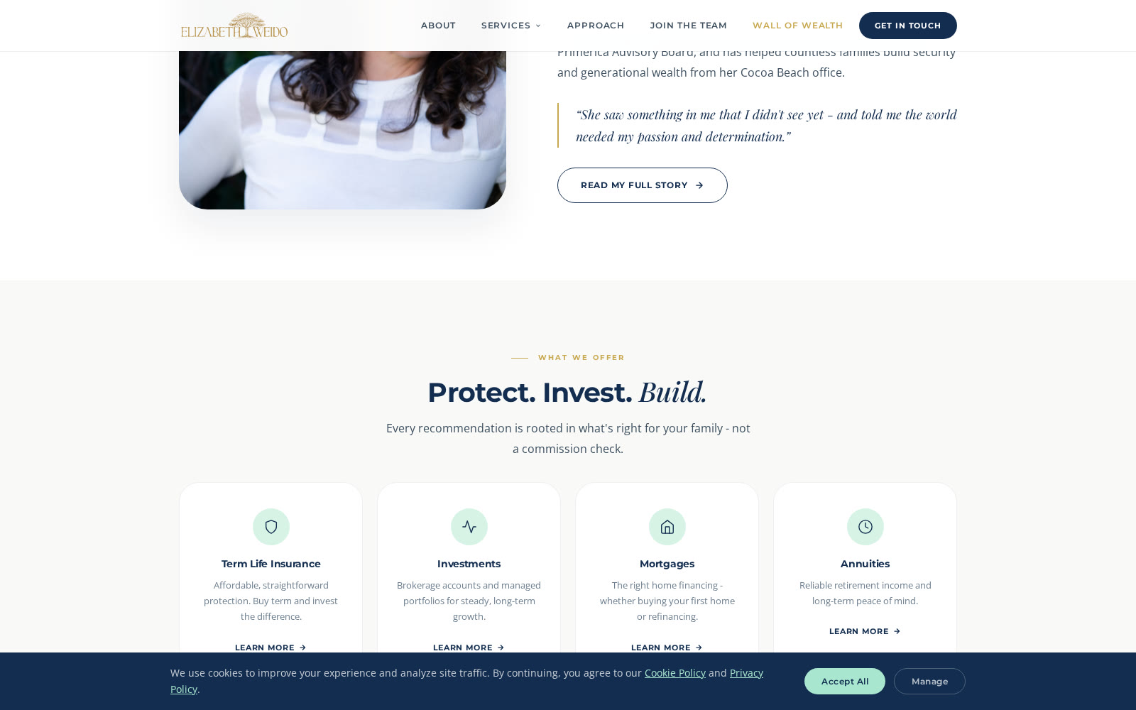
Architecture: Homepage (hero with animated preloader, trust bar with credentials, service overview), About (her journey and mission), Services (4-card layout for Term Life, Investments, Mortgages, Annuities), individual service pages with deep education, Approach (philosophy and values), Join the Team (recruiting), Contact, plus legal pages (Privacy, Terms, Cookie Policy, Disclaimer).
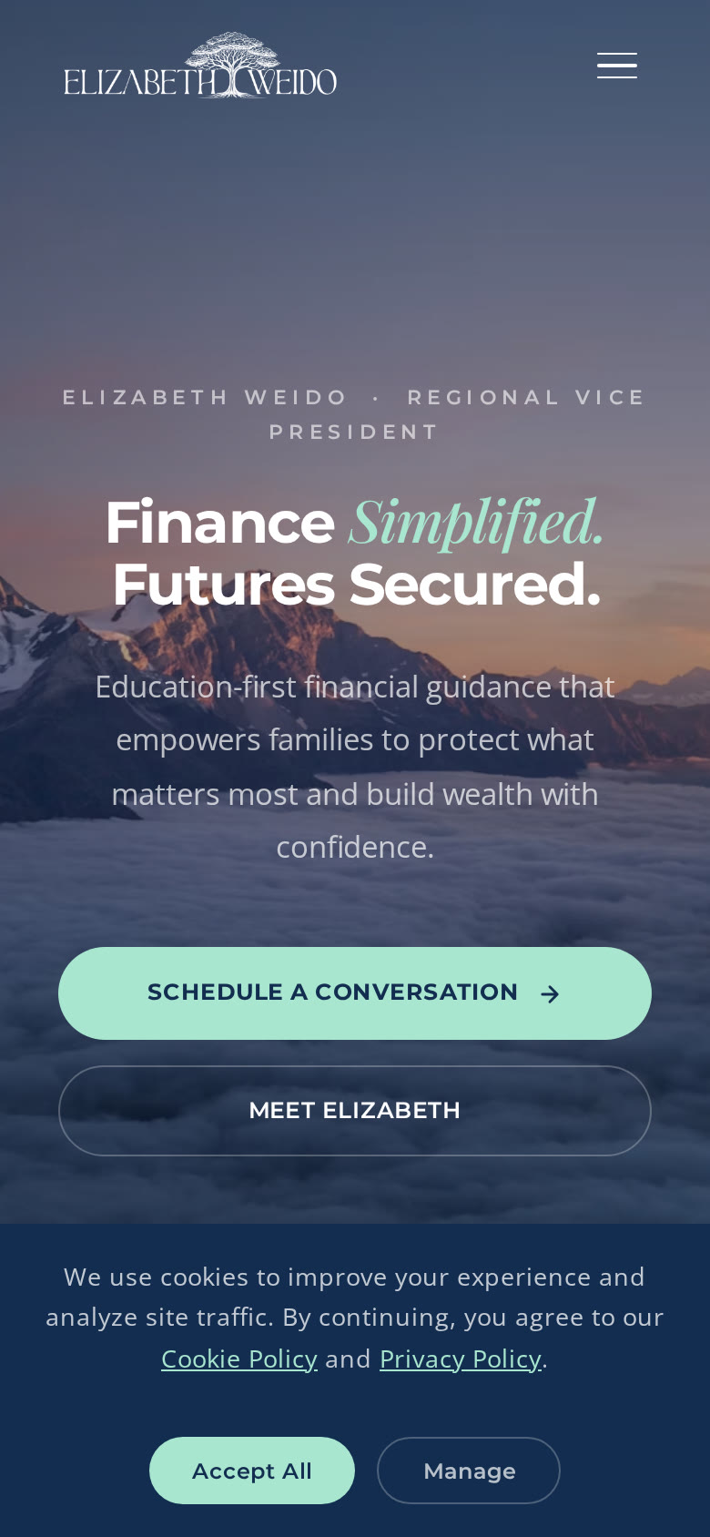
Key features: Responsive design system that works from mobile to desktop. Visual breaks with branded photography. Split-view layouts for side-by-side education. Interactive steppers showing the consultation process. Mobile-first navigation with smooth hamburger menu. Trust badges highlighting 18+ years experience and 20 states licensed.
Preloader Innovation
Custom animated figures that appear on page load. These aren't generic spinners - they're branded, approachable characters that immediately communicate the Elizabeth Weido brand feeling.
Service Architecture
Four Core Services, One Philosophy
Elizabeth's offering spans four distinct financial products, all unified by education-first positioning. Each service gets its own page, detailed explanation, and clear differentiation. The messaging always returns to: buy term and invest the difference.
01
Term Life Insurance
Affordable, straightforward protection. The foundation of every financial plan. Buy term and invest the difference - it's that simple.
02
Investments
Brokerage accounts and managed portfolios for long-term wealth growth. Education-first guidance on what, why, and how.
03
Mortgages
Licensed across 7 states for first-time buyers and refinancing. Transparent, fair, and always explained in plain language.
04
Annuities
Reliable retirement income and peace of mind. Guaranteed income you can't outlive, explained clearly.
Content approach: Each service page includes the benefit, the philosophy, the process, and real-world examples. No jargon. No pressure. Just clear education that helps families make confident decisions.
Design System
Consistency Built for Scale
The Elizabeth Weido design system is comprehensive. Every component, every interaction, every visual decision serves the brand philosophy. Built with responsive design and accessibility in mind from day one.
Preloader
Animated Figures
Custom illustrations rotate on page load. Creates immediate brand connection and sets the tone: approachable and modern.
Navigation
Responsive Nav System
Desktop nav with dropdown menus, mobile hamburger menu with clean reveal. Consistent across all 12+ pages.
Cards & Modules
Trust Bars & Service Cards
Mint-accented service cards with hover states. Trust bar showing credentials. Consistent spacing and interaction patterns.
Typography
Hierarchy & Emphasis
Cormorant Garamond for headlines (serif elegance), Inter for body (modern clarity), Montserrat for labels (technical precision).
Buttons
Call-to-Action System
Mint primary buttons for main CTAs. Outline buttons for secondary actions. Ghost buttons on dark backgrounds. Consistent sizing and feedback states.
Forms & Inputs
Contact & Lead Generation
Mint-focused form fields with proper labeling. Clear focus states. Validation feedback. Conversion-optimized for scheduling consultations.
Responsive Breakpoints: Desktop-first design scaled to tablet and mobile. Service cards adapt from 4-column to 2-column to 1-column. Navigation transforms to hamburger. All text remains readable and hierarchy is maintained across all screen sizes.
Deliverables
Everything Built, Ready to Grow
1
Complete Brand Identity
Logo, color palette, typography system, and brand guidelines. Consistent across all touchpoints.
2
Multi-Page Website
12+ pages including homepage, about, services (4 dedicated pages), approach, join team, contact, and legal pages.
3
Custom Preloader
Animated figures that load on page entrance. Creates immediate brand impression and engagement.
4
Design System Components
Cards, buttons, forms, navigation, trust bars, service showcases, and interactive steppers fully branded.
5
Responsive Framework
Mobile-first, fully responsive design. All pages work flawlessly from 320px to 4K displays.
6
Content Architecture
Service-specific education pages. Clear product explanations. Lead generation optimization for consultations.
Outcomes
From Regional VP to Category Brand
20
States Licensed
18+
Years Experience
4
Core Services
1
Clear Mission
The Build
The site, as shipped.
Fifteen pages of education-first financial guidance, plainly told and quietly styled.
The homepage, above the foldDeeper in the scrollOn the phone, where they read it